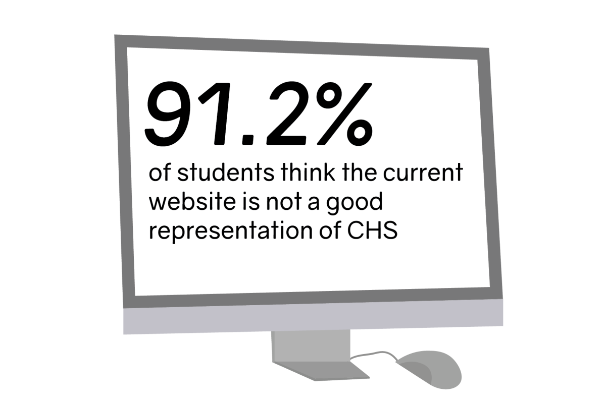
The Communications High School website is often many people’s first impression of the school. Up until now, clicking on the link to the official page brings the user to a plain, blue and white screen displaying CHS’s mission statement and course selection – a stark contrast to stereotypical CHS students: artistic, creative and unique, characteristics that should be reflected in the school’s website.
For many years, the Communications High School webpage has been left unchanged and, according to some students, basic. While blue and white are the school’s official colors, students, like freshman Anya Alston of Middletown, still feel misrepresented by the website.
“I feel like as an art school, we need to have a website that fully represents who we are,” Alston said.
After over a decade without change to the site, the Student Government Association (SGA) and school administrators decided to renovate the webpage to reflect the individuality and uniqueness of CHS students.
Publishing a website can be a long process, which may be why students haven’t seen any updates in years.
Senior and SGA President Lucy Battista of Tinton Falls said that the SGA had to meet with Principal James Gleason, Web Design students and I.T. technicians to make the new site a reality.
“We had to make sure that this was something that was possible, to actually edit it and how it would be published,and if we were allowed to even be editing it in the first place,” Battista said.
Many students were surprised at the website’s simplicity, given that CHS offers a web design course where students explore the process of creating a webpage. Designing a CHS website was even in the course curriculum, but none of the student renovations stuck.
“Considering that we’re at a design oriented school, I was disappointed to see that the old website really wasn’t anything too special,” freshman Kelly Matthews of Middletown said.
That was until seniors Keegan Foy of Wall and Kristen Gallagher of Middletown volunteered to help redesign the CHS webpage. Both students took Advanced Web Design and are very experienced with constructing websites.
“It’s such a vibrant place and there’s so much going on,” Foy said. “I just feel like the current website doesn’t really reflect that.”
Foy and Gallager’s main goal with the new website was to accurately reflect the artistic and creative minds at CHS in the form of graphics, students’ projects and pictures from events. Foy and Gallagher hope to add artwork showcasing the lives and talents of CHS students to the website, giving it more personality.
The new website took around 3 months to design. It started with vision boards and mock ups, but is almost complete. The pair is unsure when the webpage will be published.
“It was super fun to express what we love about CHS in the form of a website,” Gallagher said. “I remember looking through the CHS website as an eighth-grader, and I hope future generations of students will use our website to determine if CHS is a place they would want to call home. I hope everyone will love our website as much as we do.”


