

Are bright colors becoming a pigment of the imagination?
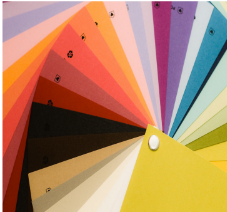
PHOTO OBTAINED FROM FLICKR THROUGH CREATIVE COMMONS
Fashion, interior design, and other media are losing their vibrancy to the dismay of the general population. “2.26.09: color wheel” by the Dalogs is licensed under CC BY 2.0. https://creativecommons.org/licenses/by/2.0/
November 24, 2022
Life has actually become grayer, according to a study conducted by the British Science Museum.
The London-based museum analyzed ancient and modern objects to arrive at their conclusion: older objects supposedly contained more color and design, but as time passed, the bright colors faded into lifeless and plastic tones. In fact, Dunn-Edwards Paints reports recent popular color palettes often feature shades of gray and white paired with other muted colors. Color’s downfall has also been noted in fashion, logos, technology and our very own homes.
The cause of society’s newfound “colorblindness” can be blamed on our technological society, which places the utmost value on efficiency. Minimalism, a result of this new era, rose to popularity and communicated a simple philosophy: “Less is more.” While this style is about reducing the unnecessary, its critics say it stifles creativity.
However, logos were losing detail, color and shading before minimalism seized the corporate world. The Firefox logo is an excellent example of this; as years passed, the fox and planet slowly lost the elements that made their logo unique, such as the fox’s facial features and texture, the planet’s continents and some of the colors. Companies believe their less-detailed logo is cleaner, but artists such as sophomore Chloe Scardino of Wall Township disagree.
Fast food chains have simplified their logos and the design of their restaurants as well. Many lean towards disappointment when discussing their feelings on the matter.
Signs, play areas and even the packaging of the happy meals of the famous chain restaurant McDonald’s have dulled their colors, from bright red and yellow to browns and silvers. Junior Kelly O’Toole of Manasquan reflects on this mass design.
“I liked the childhood feel of seeing those bright colors, and that kind of went away with everything being so simplified,” O’Toole said.
Illustration and Design teacher Laura Fallon has mixed feelings on these mass corporate redesigns, including the recent Taco Bell logo change.
“I don’t dislike it, but I do think it loses some of the charm of the original logo,” Fallon said.
For those on the corporate end, this wave of minimalism has proven to be nothing but beneficial. According to T-Art Magazine, designs with restricted color palettes, simple patterns and basic shapes are easier to rescale or change on a whim.
“Logos have to work in many different places now. The minimal ones work well for apps and digital media,” Fallon explained.
Though some dislike this grayer world, it’s important to take into account both the advantages and disadvantages. A simplified logo can be considered cutting-edge or a disappointment depending on one’s interpretation.
“It’s just definitely something interesting to think about, how much we’re minimalizing our lives too,” O’Toole said.