NAHS puts finishing touches on new mural
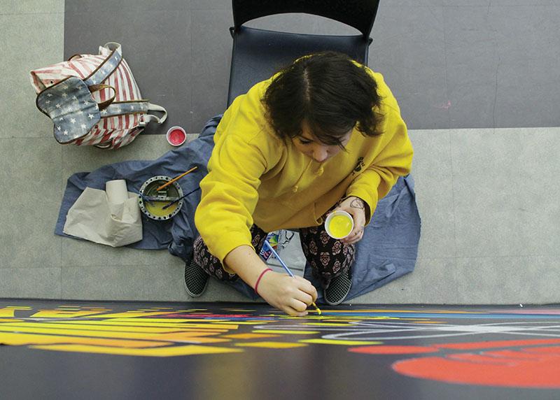
NAHS members work on finishing the new mural.
February 27, 2017
The National Art Honors Society (NAHS) is finishing up its new mural in the cafeteria, which is expected to be completed by mid-to-late February, NAHS adviser and art teacher Shelley Ortner said. The project replaced the old mural, which was painted in 2004, that formerly occupied the same wall space.
Ortner said the decision to replace the old mural stemmed mainly from the outdated technology featured in the artwork, such as a transistor radio and an old-style PC.
“As a school that focuses on using new technology, we [NAHS] thought it was time to refresh,” Ortner said.
Ortner detailed the development and selection of the new design.
“NAHS met last year and formed focus groups to redesign the mural,” Ortner said. “The groups developed multiple themes but the final design is actually a combination of two ideas.”
NAHS President and senior Sydney Foo Siam of Milestone said the focus groups created two final designs, which were then put to a vote.
“The design was chosen via a whole school survey sent out towards the end of last year,” Foo Siam said. “Everyone was given two design options, and the design that got the most votes was chosen.”
Foo Siam described the final design as “similar to a Banksy mural,” with “a figure pulling back a curtain that looks like a bookshelf to expose icons floating into space.” The painted icons include cameras, paint brushes, print registration marks and a light bulb.
Painting the mural has not come without difficulty, Ortner said. Issues have included “everything from paint not adhering to the wall to covering the dark blue through multiple coats of primer to proportion issues when the design was enlarged in that space,” Ortner said, adding that “putting in basic colors was easy, but now that more detailed painting with shading is needed, it requires much more patience.”
Student reactions to the new mural are varied. Junior Danny Kimball of Middletown expressed his concerns with the design.
“I feel that the new design is a little too crowded and the colors don’t fit all that well,” Kimball said. “Overall, I wish the picture was a little more coordinated, but a change was definitely needed.”
Sophomore Emma Hecht of Wall favors the new mural.
“It stands out more, whereas the old mural blended in,” Hecht said. “It’s really creative and I think it encapsulates the aura of CHS perfectly.”


